Sony's E3 presentation commenced last night at 2 am GMT, and after some time into their presentation they finally did it; they revealed the PS4 console. If you missed it then here it is again:
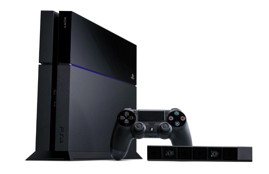 |
Ain't it pretty!
So there we have it, the next-gen console war is now all hands on deck! The long wait is finally over.
From here the battle will come down to the the transparency of information about each console, the limitations and restrictions in place for the hardware when in the hands of the consumer, and the first party/third party IP that each giant is bringing into the fray.
However, I want to address something that I feel is uncanny - what's with the oddly similar design of the PS4 and Xbox One? Seriously, have a look!
I'm certainly not saying that they look the same, because there are some clear distinctions between the two. Yet there are notable similarities between the consoles that are just too uncanny.
At the base of it all they are essentially two black boxes. The Xbox One looks to be slightly bigger than the PS4, but the colour choice and segmentation of the two consoles aren't too dissimilar.
To elaborate; they both have a line scored across the top creating segmentations, which are a clear centre piece design feature for both consoles.
There's the odd use of block colour on one side of both consoles which, whilst adding a sleek style to the overall design, is fluky considering that both console designers felt this was a necessary touch. It's even more eerily weird when you think that each consoles 'line' difference of separation between the chosen placing, is only a few centimetres.
The lack of creativity for the design of both the PS4 and Xbox One consoles, and the coincidental similarities, makes this unveiling slightly anti-climatic.
The Xbox One seems to be a physical hybrid between the Xbox Classic "radiator" design, and the Xbox 360 Elite/S size. Equally the new console brings together the matt and smooth face plates of both the 360 Elite and S separated by the central dividing line.
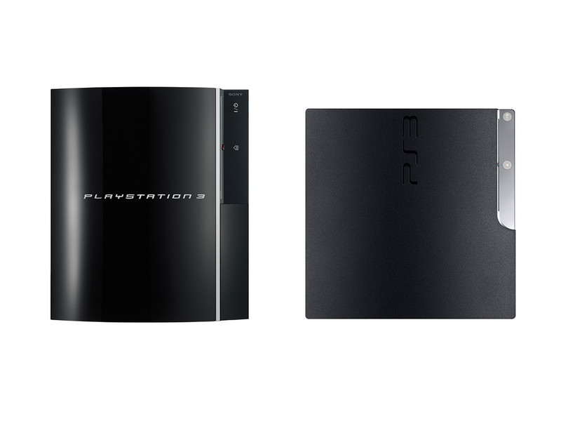
The PS4, meanwhile, bares the dimensions of the PS3 slim with the block features of the original PS2. Furthermore, it shares a similar matted-smooth skin that the Xbox One dons, but is clearly rooted from the combination of the original PS3 smooth and shiny skin, and the PS3 Slim matted finish.
Both, however, look like a product of procreation between the parent consoles and seem to have some genetic traits that have passed down through their design DNA.
It's at this point some of you reading this might be thinking, "this is completely pointless writing!" but when you think about it, it really isn't.
I want my next console -which ever it may be- to look good and sit pretty amongst the number of already existing black or grey boxes in my living space. I want it to stand out, but subtly. And I don't want it to look like I can heat my feet with it or store papers in it. It has to fit with 'ambience' of my living rooms design; no one wants a space hopper ball in a contemporary, mushroom coloured room. Right?
Thankfully the two consoles aren't eye sores but if I were to choose one of these based on visual appearances, then I'd have to go for the PS4.
Sorry but it's the least VHS/DVD looking of the two.
What do you guys think? How do you feel about the designs of the next-gen consoles and do you think more could have been done with them?
|


No comments:
Post a Comment
Please keep your comments as clean as possible.
Any comments of bad tastes and disrespect will be removed and publisher will be blocked.
Banter, joke and have fun!